Tuesday, February 7, 2012

Evaluation 4: How did you use media technologies in the construction and research, planning and evaluation stages?

For this final question I will talk about how equipment, software and websites have helped me throughout my course. This can be split into three separate groups, for which I will be focussing on the different sections of my course; Planning and Research, Construction, and the Evaluation.

Equipment:

The equipment that I used throughout the course was provided to me by the JCG Media department and part myself. This consisted of a Canon 7D camera, various pieces of equipment to go with the camera, computers (Macs) at college, and the use of my own Windows based laptop which I used at home for some of my coursework.
    Camera and Equipment:
        To show the equipment that I used during my course I have put together this short video explaining everything available to me and how it works:

    Computers:
        At college, I was provided with a Mac so that I could access the internet and various programs to assist me with my coursework as it is all going to be constructed online so that It is available anywhere I go as long as I have an internet connection. At home I used my laptop to allow me to work on my coursework when away from the classroom. (I upgraded the RAM in my laptop from 2GB to 4GB so that video editing and heavy duty program usage was easier to deal with and allowed me to get on with my work more efficiently)

Software:

The software that I used during my course consisted mainly of video editing software and image editing software. Programs that I used on the mac included Photoshop, InDesign and Final Cut Pro. At home on my own computer I could use Photoshop and Indesign, however as Final Cut Pro is only supported on MacOS, I found a program called Sony Vegas Pro which is essentially the Windows equivalent. My Construction post shows how I used these programs within the second video that I posted here.
Without the use of this software I would not have been able to create any of the work that I have done to anywhere near the standard that I have been able to. Photoshop allows editing down to even a single pixel and has a lot more flexibility than most other image editing programs available. Sony Vegas was a great tool for video editing, with a very simple user interface that was easy to negotiate, with any special effects added via a single drag and drop.

Websites:

Now this may not be quite such an obvious section to include, but for me the use of websites throughout the course has been tremendous. A lot of what I have done relies heavily on various websites including, blogger, youtube, screenr, and to some extent the JCGMedia website, as well as a little help from facebook in the final stages of publishing my music video to the web.


Script:
"Hello, in this video I will be showing you the websites that I have used throughout my course which have aided me in creating a fairly interactive blog, and allowing me to link between different websites so that I can show all of the work that I have done.

First up is Screenr. This is a one-click solution if you want to make a short screenflow. This is what I am using now and as you can see and hear it creates a high quality video which you can upload within minutes.

Next we have the JCGMedia website. This is the main link between home and college. Here I can find almost everything that we have studied in class, and probably more if I look hard enough. It has been one of my most valuable resources.

Facebook was not such a useful tool in this, however it came into its own when I asked my friends and some others to watch the video and then take the survey. There are no comments under the video as there is a link to the survey straight from youtube.

Here is where I uploaded my music video and then linked other pages to it. As you can see I have a couple of comments, however the majority of my feedback came from surveymonkey.com

Survey monkey is another free online tool which allows you to create a survey of as many questions you want, and pretty much any way to respond. Once you are happy that enough people have taken the survey you can collect the response and represent them graphically, as I have done on my blog.

Blogger is the site that has brought everything I have done together. I can easily link or embed videos, upload pictures, and write essays in as many posts as I like. This is where all of my coursework is being kept, so I can access it anywhere as long as I have an internet connection. A great feature about blogger is that it allows you to have a personalised domain, so it is a lot easier to link your friends and family to it."

Monday, February 6, 2012

Evaluation 3: What have you learned from your audience feedback?

Earlier in my blog I published a post which included the feedback that I received after posting my video on youtube and creating a survey to go with it. once people had seen the video I asked if they could complete the survey to let me know what they thought of it.
The large majority of people that I asked were of my own age (so from 17 to about 20) with a couple of exceptions. The main idea of using a survey to gain feedback was so that there was less of a personal pressure when answering the questions. What I mean by this is that people are generally nicer to your face than they may be when they are just filling in a form about something you have done.
Almost 80% of the people interviewed did enjoy watching the music video, whilst almost 85% of them thought that the video did fit the genre, with only two responses who thought that the video did not suit its proposed genre.
The choice of actor was more controversial however, with just over half the replies agreeing that the choice of actor fitted the music video. The rest were either not convinced or did not agree that there was an appropriate choice of actor.
The last multiple choice question I began to get a little suspicious of as throughout the survey it seems that two of the people taking the survey were not taking it seriously and filled in either no on every question, and 1 in the 1 to 10 option. If they were being genuine, the average rating of my music video compared with a professional video would be 6.6, excluding these two results would be 7.3, which I am contented with considering this is my first music video.

So what have I learned?
From my feedback I have found that for my first music video I think I gained a good idea of what it is all about. Gaining a result of 7.3 out of 10 when compared to a proffesional music video has made me very happy. Here is a screen grab of the youtube comments that I have recieved:


From these comments I have learned some things about shooting the Acoustic/Alternative genre. I have found that you don't need to use a tripod for every shot you take, and that a lot of the time it can be better not to use a tripod. Of course it is still sensible to set the camera on a tripod where sensible and not to go too far as the camera work will just look messy and annoying to watch after a while.
Another big thing that I have taken from both my feedback and the course is that when people say a music video, you will go out and shoot somebody singing along to a song in various locations etc, and yes it will be ok and be fit for purpose. But if you watch professional videos you will find that a lot of the time there is not so much singing as you might first think, and in some cases there is no singing whatsoever. Of course this relies heavily on genre, but more often than not, a good music video has a lot of fill shots which create the majority of the narrative of the video.

Sunday, February 5, 2012

Evaluation 2: How effective is the combination of your main product and ancillary texts?

For this question I will be taking screen grabs and video and talking about them using a voiceover video. I will be considering the camerawork of my video, the digipak designs, the special effects, editing and cutting, as well as the ancillary tasks that I completed.

Video Ancillary and Final Video:


Digipaks and Posters:

Saturday, February 4, 2012

Evaluation 1: In what ways does your media product use, develop or challenge forms and conventions of real media products?

Screengrab 9 images regarding the six aspects:
1. Actor choice and her relevance to the music video
2. Locations and their similarity with other music videos of the same genre
3. Props used, if any
4. Costumes
5. As many Goodwin theories as possible
6. Choice of lighting and mise-en-scene


Screengrabs:
1. Props: I used only a few props for my music video (shown in pictures 1 and 4). These consisted of a piano, some headphones and a microphone stand. These were only simple props and easily accessible, but add a lot to the video, enhancing its 'believability'. The playing of the piano also comes under one of Andrew Goodwin's theories, 'There is a relationship between the music and the visuals'. The fact that we see the actor playing the piano at the same time that we hear it playing satisfies this theory. This brings focus on the music and should, in theory, let the listener become more involved with the music, rather than sitting watching a few clips put together to some background music. It creates more of a link between what has been videoed and the music that is being listened to.

2. Screen grab 2 is part location, part costumes. It shows the actor down on the beachside, so where she might like to hang out in her spare time, equating to the possible kind of lifestyle she likes to lead. And the sunglasses and coat with scarf are a typical costume for this genre, which I discussed in an earlier post.

3. The opening location, in fact this is my own living room where I have a piano. I found that when we had the main light on it produced a nice sort of lens flare around the actors head, which gave a really nice effect in my opinion (especially when coupled with the shallow depth of field I used).

4. This is another location I used. It is the recording studio at Beaulieu Convent School. They kindly let me go down there one lunchtime to let me do some filming for my music video. Because it is an actual recording studio they already had a microphone stand and instruments set up in the room, allowing for appropriate mise-en-scene.

5. AS opposed to being a fill shot, as we saw in picture 2, this is part of the chorus where we have a close up whilst the actor is walking forwards. The use of a close up allowed for a shallow depth of field, so anything in the backround is blurred, bringing all of the focus onto the artist, and so keeping to Goodwin's theory of the demands of the record label to have as many close ups of the artist as possible/is apprpriate.

6. This is at another of the locations at which I chose to shoot the music video. It is in the woods, which is typical for any acoustic video, being out, close to nature. It reinforces this 'typical lifestyle' that I am trying to portray throughout the video. The easiest way I can explain it is to say that you generally wouldn't see an acoustic music video at night on backstreets of a city or in a bus station (unless of course there is some kind of intertectual reference to it). You are much more likely to see an acoustic video on the beach, in the woods, in a park, around a campfire etc...

7. This picture shows another of the costumes that I chose to use. We can see welly boots (which turn up a surprising amount!), an overcoat with a scarf (the same scarf as we saw earlier on in the video), and jeans (a fairly typical item of clothing for this genre). This picture is also the introduction of the final location of where I shot my video. It is a long pier, which is a little out of the way so is not normally very busy, allowing for some creative and meaningful  to be

8. I chose this shot maily because of the absence of any other person along such a long pier. This should make the video more personal as a lot of people would notice this and realise that even when nobody else is there, the artist will still sing the words to the person they are meant for and again fulfils Goodwin's theory regarding the demands of the Record Company, and a slight bit of intertextual reference.

9. I think this screengrab shows the biggest relationship between my video and Andrew Goodwin's theories. It is a close up of the artist, which record labels want so that people can easily recognise the artist when they see them in a different context. The reasoning for having the camera head on and her looking right into the lens is to create the effect to the audience, that she is singing directly to them (or they know that there is somebody specific being sung to), which is a relationship between the lyrics and the visuals, another of Goodwin's theories.

Friday, February 3, 2012

Video Feedback

In this post I will be putting screen grabs of the responses that I got from people who watched my video. These are split into five questions, the last of which was voluntary to answer, being laid out in a text format. I will write down a couple of the responses that I received from this question. (Please click on the pictures to enlarge them for easier viewing).


Question 5 responses:
1. The second section, the cut scenes were too quick. e.g. from singer to sun in the trees - this is very nit picky however. Very good job!

2. Really enjoyed this, thought it was well thought out, fitted with the music... going to watch again, now.

3. For an ametuar video, it is brilliant. Looks like a lot of fun to do - doubt I could do any better to be fair, keep up the good work!

Construction

For my construction post I will be making a couple of videos to show different aspects about how I actually made my  music video and ancillary tasks. To do this I will be using Screenr to record my screen whilt I talk over the top.

The first video will talk about the different shots that I used, why I used them and the results that I am hoping that they will have to the audience:


Script for this video:
     "For my music video I decided against using a tripod for many of the shots. I found that a little bit of unsteadiness can add to the feeling a music video gives the audience, so most of my camerawork is handheld with a shallow depth of field and manual focus.
As you can see in the clip I have chosen here it is not all just shots of the actor singing along to the song, I shot some footage of the sun glaring through some overhead trees as I walked up a hill, which I thought went nicely with the genre.
Also here we see two different shot distances, at first it is a medium shot, and after a small interlude we get a close up. The majority of the shots in my music video are close ups because I was conscious of Goodwin’s theory about how record labels like lots of close ups of the artist in music videos.
At the beginning of the video we see her playing the piano along with the music in short cuts as the chords change between lines. I liked this transition between shots and combined with the shallow depth of field I think gave a nice effect and makes the music of the song that much more apparent for anyone watching the video.
Right from the beginning of the video I have included a fill shot, and throughout the video we see many more of these fill shots. I have found that in a lot of videos that I’ve watched you don’t see the artist actually singing all the time, but in fact there are a surprising number of shots which consist of just mucking around, like out takes if you will. This method really appealed to me, so I took a lot of footage just walking around and sitting down chatting, having fun so I could get some smiles and laughter between shots. I think this method allows the viewer to relate more easily to the video that they are watching."

This next video talks about my ancillary tasks, and particulartly the programs that I used to complete them:


Script for this video:
I this video I will be talking about how I have put together both my final music video, and each of my ancillary tasks. First up we have adobe Photoshop. This is where I designed the posters and images to go into the digipaks. Photoshop is the main program for editing your images before you export them to use them in other programs…
Next up we have Adobe in design. This is a neat and fairly simple program which calls upon basic editing techniques and a basic idea of what you want your final outcome to look like. This is where the digipaks were made…
Lastly we have a program called Sony Vegas Pro 12. This is high spec video editing software made by sony. It is essentially the Windows Equivalent to the widely known Mac based software, Final Cut Pro. Here I have opened up my final music video and will go over just a couple of the basic editing features of the program.

Ancillary Tasks

This post includes the final Digipak and Poster that I have made to go alongside my final music video. These were made on Adobe InDesign and Adobe Photoshop, as were the rest of the designs that I have made.

1. Digipak:


2. Poster:

Final Video

Here is my final video which I have uploaded to youtube. I will shortly be making another post which looks at where I could have improved the video, any changes I could make and generally what people thought of the video, in respect to other professional music videos that have been made by actual recording companies.

Thursday, February 2, 2012

Storyboard and Animatic:

So that I can get an idea of the final product I have drawn screen grabs of the shots that I would like to include in my music video. Rather than listing them shot 1, 2, 3 etc... and drawing them in order repeatedly. I have made an Animatic using them. This will mean that shots can be reused easily if they are to be reused in the final video and means that I can add some kind of animation to each of them using a video version.

Here are the screen grabs that I have drawn to represent the different shots that will be included in my music video:


Here is the Animatic, it is not supposed to be a perfect 'still' construction of my video, but is supposed to give me a good idea of the final outcome, and perhaps give me some more ideas of fill shots or extra shots when constructing the final video.

Wednesday, February 1, 2012

Time Management: iCal

This post consists of screen grabs that I have taken of iCal on a college Mac computer. It shows what I will be doing and when throughout the coursework section of my course:


Digipaks: Mockups

Following are four different designs for the potential digipaks that may represent the music video I will be making. I have used a mixture of pictures that I have taken myself, and pictures taken from the internet. I have tried to keep each design to its own genre (i.e. using similar photos, colours, scenes for each of the faces and disc).

Design 1:

Design 2:

Design 3:


Monday, January 30, 2012

Costumes

In order to know what type of clothing, or genre of clothing if you will, that I will need my actor to have, I am going to take screen shots of various artists as they appear in their music videos and talk about how appropriate each style/genre is.


Here are eight images of artists who are similar to Ellie Goulding (pictured one from the left on top level). These artists include KT Tunstall, Florence + The Machine, Marina and The Diamonds, and a few more. These artists I found by typing 'artists like ellie goulding' into google and finding a list of artists that somebody had made. I then searched these artists in google images to find the above pictures.
As we can see for the most part it is fairly casual clothing, things you wouldn't be surprised to see being worn on the high street.
This shows me that jeans are an acceptable way to go, as well as a loose-fitting top, or a tighter top with a summer jacket over the top. I will do what I can to get the clothing right for my own video, so that it doesn't stand out from the video, and looks natural given the locations being used.

Sunday, January 29, 2012

Locations:

Location is a huge consideration when shooting a music video. When chosen correctly it gives a very natural feel to the video and generally goes unnoticed by the audience. When I say unnoticed I mean that the audience does not take a mental note or is surprised of a location because it doesn't look right.
In order to achieve a more successful video the locations you choose to shoot at have to fit with the genre, which is why I have chosen three locations to shoot my video.

The first is St Ouens bay. This, as you can see in the picture is quite a rural part of the island I live on, with a promenade along the beach and wide open sand dunes and scrubland which should be able to give some nice scenery and, given the genre I think a lot of footage can be shot here.


The next location is St Catherines. At the opposite end of the island there is a small woodland area called St Catherines woods, with a long breakwater just down the road from it. Both of these locations I hope to use in the video as they are appropriate to the genre and should be able to give me a great number of opportunities for some fill shots as well as just the shots of the actor singing.
The last of my locations is a recording studio at Beaulieu Convent School. This room I will use to show the song as if it were being recorded. I have seen this idea used in some professional videos and I believe it would work well for this song. I find it makes the song and video that much more real to watch, and gives the song and actor more of an identity than simply doing shot after shot of her walking around singing.

Saturday, January 28, 2012

Choice of Actor

Ellie Goulding is in her early to mid twenties, so she has a young clean voice which is easily identifiable. Knowing this I then needed to find a young female who would be willing to be videoed miming to a song, as well as being a suitable replacement for Ellie (i.e. she needs to look like it could actually be her singing in the music video).
After considering a few potential people I went with Sarah-Lynne Gallaher, a classmate who was willing to be in the video. Part of this decision consisted of a short video interview where she mimed to the song and I then lip synced the music over the top. You can see the video below:

Friday, January 27, 2012

Target Audience

In order to create a music video of a specific genre, I need to understand the type of audience I have to attract, what they are interested in or what they find interesting in a music video, why they would watch it etc...
From this I can understand what types of shot I should include in my music video and how it is edited. This can be gained most easily by producing a survey to get real information about what different aged people prefer to watch, which videos are most popular, and looking at how they have been shot should give me an idea of how I should produce my own video.
I created a survey through the website SurveyMonkey in order to gain information about the different aspects of music videos in general. Here is a screenshot of my the survey that I created (here is the live link to it).

Responses:


From these results I can have a better idea of what a potential audience to my music video are looking to see in it. I did have a slight number more male people take the survey than female, so my results are likely to be swayed towards the what a male viewer is looking for, as opposed to a female, there being not really much of a difference in the numbers of each I am happy to take the results I have and rely on them for the production of my music video.
I was not surprised at the age of people who took my survey as they are the most likely to come across my survey, and most probably are the largest group of people who watch music videos online. The most popular genre was rock, which is not the genre that I have chosen. I am not too worried about this however as acoustic came in a joint second with pop, so I am fairly sure that this genre is fine to use as out of the relatively small sample of people who took the survey it received respectable recognition.
My next result did surprise me, with the most popular answer being that people who I surveyed watch music videos just more than once a month. I would have thought that people would watch music videos at least once a week, 

Thursday, January 26, 2012

Song Choice: Ellie Goulding - Your Song

Video:


Lyrics:
It's a little bit funny, this feeling inside
I'm not one of those who can easily hide
I don't have much money, but boy if I did
I'd by a big house where we both could live

So excuse me forgetting, but these things I do
See I've forgotten of they're green or they're blue
Anyway the thing is what I really mean
Yours are the sweetest eyes I've ever seen

And you can tell everybody this is your song
It may be quite simple, but now that it's done
I hope you don't mind, I hope you don't mind that I put down in words
How wonderful life is now you're in the world

If I was a sculptor, but then again no
Or a girl who makes potions in a traveling show
I know it's not much, but its the best I can do
My gift is my song, and this one's for you

And you can tell everybody this is your song
It many be quite simple, but now that it's done
I hope you don't mind, I hope you don't mind that I put down in words
How wonderful life is now you're in the world.


Reason For Choice:
      Ellie Goulding is quite a recent artist compared with other artists around at the moment. She has a very unique style, unlike other more 'rocky' artists who can sound very similar (muse, the killers, foo fighters etc..) Ellie has her own style and you will see what I mean if you listen through her album 'Bright Lights'. Even songs that she has made covers of she has made her own, like the one I have chosen, originally written by Elton John.
      Ellie is one of my favourite artists that I can just sit and listen to, 'Your Song' being one of her best songs in my opinion, and for that reason I would like to make my own video for it. I feel that if I choose a song that I really like to listen to, it will be easier to think about the feel I want to give in the video, and so it should make it easier to plan the shots I want to include and the locations I want to include in the video.

Wednesday, January 25, 2012

Ancillary Task: Eminem - When I'm Gone

This is the ancillary task I was set. We were put into groups of four and had to come up with a song, and go out and make a music video pretty much zero planning, just a chosen song and a camera. It was up to the group which shots to take and when in the video. (My particular group did not quite finish the video and there are a couple of blank parts for which we did not have footage), but the overall look, considering there was zero planning, limited props and little time I think we gave it a fair go.

Tuesday, January 24, 2012

Photoshop Tutorials

In order to enhance my digital editing skills, I will be searching for and working through some online tutorials using Adobe Photoshop CS4. I will provide web links to the tutorials that will be carried out and step by step screen grabs will be posted for each tutorial.
The better I can familiarise myself with the program and its features, the more advanced my final product has the potential to be.

Tutorial 1:
The first tutorial I will be creating an imaginary picture made from sections of photographs and textures. The idea is to create an image that looks to have been painted, yet has detail to 300 dpi, which is far too detailed for anyone to paint.

Web link to tutorial (opens in a new window)

Screen Grabs:
(Click on images to enlarge)

This screen grab shows the source files that I used to create the final image. You can see that the image is made up of 8 different images, with the final image included in the folder.
 Part one: Here I have copied the sky layer and reflected it vertically towards the bottom of the canvas. The visible line between each image has been blended so that there is no definite point of horizon. The reflected part has also been given a slight texture where picture of some calm sea has been put over the top with a low opacity.
 Part two: Here I have copied and pasted a raft on to the previous image. The reflection was brought in after and the edge was erased out softly so that it looks to be floating in the sky, yet floating on water.
Part three: The next section was to copy and paste the phone box, woman and ships on top of the previous image. The phone box and woman were cut out of other images using the 'polygon select' tool, and a small plant was erased from the bottom of the phone box using the 'clone stamp' tool. The ship was downloaded as a .png file and so could be copied and pasted straight into the image.

 Part four: Part four consists only of adding texture to the image. Three different textured were added here and give a very specific look to the image, greatly improving the look of the image and adding a lot of detail. The raft and ships are less detailed, however there is a lot more atmosphere to the image.
 Part five: The final part is of the final image. The image has been made to look like it has been painted, some colour correction has been carried out and a radial glow lighting effect has been added to make the main focus of the image stand out more than it did before.
Here is the final image from this tutorial

Tutorial 2:
This next tutorial is one of my own. I use techniques that I have picked up from online tutorials, including a trick with the Threshold Adjustment of the image and by using specific blending modes to adjust the colour of the image. There is no physical image manipulation involved, only colour correction.

Screen Grabs:
(Click on images to enlarge)

Here is the original image I took at Sorel Point on Jersey's north coast. We can see that it is quite bland and not particularly contrasting, with almost a 'fog' over the top of the image. The aim of this tutorial is to get rid of this smog and enhance the colours already in the photograph.
The first step is to make a threshold layer above the original image. This will turn it black and white, as we can see in the image to the left. This is only temporary, and will be explained below.
We need to find the brightest and darkest points in the image.
To find the darkest part of the image, we take the threshold down so that only the darkest specs of the image are shown as black dots. We can mark these point by taking the eyedropper tool and making a 3x3 pixel selection of the darkest area of the image. 
Now we have to find our second reference point. To do this we take the threshold to its highest point and select any white area still left over. If there is no white at the extreme top end, then we can take the threshold back down until we find the lightest part of the image appear as white.
Now we can delete the threshold layer, leaving behind our two reference points as shown in the image (left). In order to see both you may have to click on the image to enlarge it.
Now that we have our two reference points, we can create a curves layer above the background layer. There are three eyedropper icons within the curves box (one white, one grey, one black). First we click on the white eyedropper and click within the second (bright) reference point., and then we do the same for the black eyedropper, but this time clicking within the first (dark) reference point. This does not make a significant difference, however we can see that there is some more shadowing at the bottom of the image.
The biggest difference is made when we select the grey eyedropper. This is the part where we select different colours within the image to see what effect they will have on the overall colour of the image. Here I decide to use a greyish colour on the cliff face, keeping the image fairly neutral still.
After this has been done we select both layers and merge them to become a single layer.
We can still see that the image is still a little white washed, so to correct this I have made an Exposure layer to remove this unwanted mist.
To do this I left the exposure setting at 0 and the offset also at 0. After some experimentation I found that the best result was to move the gamma bar up so that it read 0.5. This seems to darken the image, but there is no mist left over the top and the colours seem more vibrant, giving the image more depth than it had before.
The final adjustment that I made was (after merging the two previous layers once more) to add a new, blank layer above the background layer. I then filled the whole layer with a mid-brown colour and reduced the layer's opacity to 40%. The final adjustment made was to set the blending mode to Hue, which brought all of the colours in the image closer to the brown that I had filled the layer with. The point of this was to give the image a slightly warmer feel with less greenery. This is a picture of a quarry after all, the less green it is the more quarry-esk it will look.
Here is a higher quality .png version of the final image, rather than just having the screen shot to go on. My favourite part of this image is how the texture of the fence has changed from the original photograph. There seems to also be a heightened sense of detail within the image, making the depth of it all seem a lot more real, less like looking at a 2D photograph as we were at the beginning.


Tutorial 3:
This is a fairly basic tutorial that shows how you can modify an image to give it a different meaning. It will be turning a simple red apple into some kind of animalistic fruit which most people are shocked at when they see. So far, everybody I have shown the image to have had a negative reaction to it, but have been impressed about how it has been put together.

Screen Grabs:
(Click on images to enlarge)

The first step is to find or take a picture of an apple and open it on a new canvas in Photoshop. It may be useful at this point to unlock the layer by double-clicking on it and pressing 'OK' on the dialogue box that appears, however for this tutorial this step is not essential and I did not unlock the layer in this case.
Here is the second image, it is of a tiger 'roaring', so that we can see its teeth and wide open jaw. Here I use the pen tool to roughly select the mouth of the tiger and have copied it.
I have gone back to the original apple image and pasted the mouth on top of it in a new layer. I then used 'ctrl+T' to position and resize the mouth so that it is in place on the side of the apple. The key part here is to get the mouth in such a position so that it looks like it could be on the apple, if it was placed in  the middle it just wouldn't look right.
 The next step requires using the pen tool to cut around the mouth that I want to keep. From here I press 'ctrl+shift+I' to invert my selection and then press delete, or use the eraser tool to rub out everything selected on that layer.
 After erasing the unwanted part of the mouth, I am left with just the lips and inside of the mouth, any missed parts of the mouth can be erased using the eraser tool, or if any smoothing needs to be done.
 Again, I have resized the mouth to make sure it is a good size in proportion to the apple, and so that there is a significant overlap on the top and bottom of the apple. Having selected the 'apple' layer I use the lasso tool and select the area you can see in the picture.
 Now using the 'modify-warp' tool I stretch the apple so that it joins up with the top lip of the mouth. The same is then repeated on the bottom of the apple.
 The last section consists of using the history brush tool to cover up the small white streak left on the left side of the previously selected areas after stretching them. The eraser tool is also used here to get rid of the right hand side of the apple appearing to be behind the mouth. It is also useful to erase some of the extra shadowing that just doesn't look right.

Tutorial 4:
      For my last tutorial I am going to produce a 'firework' effect from scratch. This tutorial I found only recently on iceflowstudio's website where they call it 'Abstract Fireworks' and can be found in their Photoshop videos library.
      I chose to go over this tutorial purely because it shows how simple it can be to create really stunning, and lifelike (to a point) effects that can be achieved from scratch. This tutorial is quite a bit more advanced and complicated to follow, so new Photoshop users may find it difficult to follow. Don't worry though, as soon as the basics are covered, you will find it easy enough.

Screen Gabs:
(Click on images to enlarge)

 First we need to create a custom brush, so open a new canvas with dimensions 100 pixels wide by 500 pixels high. 300 pixles per inch resolution and a transparent background. It should look like the image on the left.
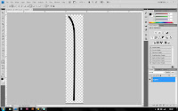
 Now we need to grab the pen tool (P). Whilst holding shift make a point at the bottom, then click near the top and a vertical line will be produced. Now release the shift key and click at the top of the canvas and to the left to create a kind of upside down 'L' shape. Then whilst we have the pen tool selected hold the 'alt' key and hold-click and drag away from the middle point until a nice smooth curve is produced, as we can see in the image on the left.

 Now we need to select the brush tool. Be sure to press 'D' to set the foreground and background colours to defaults, and then select a brush with a hardness of 100% and a size of 9 pixels. Now the brush is set up, go back to the pen tool and right click on the path we made using the pen tool just before and select 'Stroke Path', from the drop down list then choose 'Brush' and click ok. You will find that the path has now turned into a brush stroke. (note: make sure simulate pressure is un-ticked and to press enter after this is done to deselect the path, you will see the white line disappear)

 Now we move on to the making of the firework. To start with we need a picture of your choice (I am just using a black background in this case as it is only a tutorial). Also be sure to add a new blank and transparent layer above the background by pressing 'ctrl'+'shift'+'N' and then 'ok'.
Before we can take it any further we have to set up our brush even further by selecting the brush we just made, and pressing F5 to open the brush settings dialogue. We will need to enter the following information:
Brush Tip Shape: Size at 175 pixels, with a Spacing (ticked) of 20%
Shape Dynamics: Size Jitter at 100%, top Control set to Pen Pressure, middle control of Direction, Minimum roundness of 25%
Scattering: Both Axes unticked and at 130%, Controls off, a Count of 2, Count Jitter of 100%
Texture: Rusty copper look, Mode set to subtract, scale and depth at 100%.
Other Dynamics: Opacity Jitter and Flow Jitter set to 100%, both Controls set to off..

 The next part is the most fiddly. It will help to get some guides so press 'ctrl'+'R' to activate the rulers and then hold-click inside either the top or side border and a light blue horizontal line will appear on the canvas as you drag down/across the window. Position your guides so that they cross where you want the centre of your firework to be. Now this is done use the 'Ellipse Tool' and create three circular (hold shift whilst making the ellipse) and organise them as you can see in the image on the left.

 Now here comes the fun part! By selecting the brush we made earlier, then select the Ellipse Tool and right click on either of the three circles and once again 'Stroke Path', again select 'Brush' and make sure that your foreground colour is set to white before you click 'ok'. You will now see the wispy flare appear before you.
 A side step here. I have had a lot of trouble recently trying to deselect paths once I had created and used them. Make sure you press the 'Enter' key at this point to deselect the path and have the flare set up by itself, circle-free.
 Now we need to add some colour to the flare; So double click on the flare layer on the right hand side and this dialogue box will appear. The first step we want to take here is to add a 'Gradient Overlay'. Use the image on the left here to see the values you need to enter. You also want to produce a three stage gradient in the same style that I have, with a light orange colour on the left, and then select another colour of you choice in the middle, and a darker shade of it on the right. Here I have chosen red as my colour.

 We now want to move on to an 'Inner Glow'. This gives some depth and shine to each 'strand' of the flare and makes it look a little more realistic. Again use the values you see in the image to set up the glow correctly.
 The final part to editing this layer's properties is to add an 'Outer glow'. This will help to separate the 'strands' from each other a little more and add a sort of shine behind them and allow them to fade into the background a little more smoothly as you can see in the next image. Once again you will need to use the values in the image on the left to correctly set up the outer glow.
 The next step is to make the flare look like a firework. Explosions leave smoke behind, so it should be fitting to add some smoke to the image. Create another new layer and place it just above the background layer and below the flare layer. Then take the 'Ellipse Marquee Tool' and select around your flare as see in the image on the left.
We now need to add the smoke itself. Make sure you have your foreground colour set to your flare's colour and the background colour to black and go to 'Filter-Render-Clouds' and you should end up with something very similar to the image I have on the left here.
 Now you need to make a layer mask. Do this by clicking the button in the bottom right hand corner that looks like a grey rectangle with a white circle in the middle. Then select the brush tool with  a hardness of 0% and a size of about 300 pixels and go around the edge of the clouds to smoothen off the edges and make the smoke look a little more realistic. The smoke in real life is not too prominent, so we can reduce this layer's opacity to about 40% and make its blending mode 'Screen' and there, you have your smoke effect.

 Now we need to add some sparkles, so we need to set up a new brush; Press F5 on your keyboard and enter the following values:
Brush Tip Shape: Low hardness, size of 9 pixels, Spacing ticked and set to 300%.
Shape Dynamics: Size Jitter of 100%, everything else set to off and 0% with minimum roundness of 25%.
Scattering: Select both Axes and boost to 1000%, all controls set to off, a count of 1 and a Count Jitter of 100%

 Now simply paint onto the image in a new layer on top of everything until you are happy with the number of sparkles you have.
The final step is to right click on the flare layer and click 'Copy Layer Style' and then right click on your sparkle layer and click 'Paste Layer Style'. Congratulations, you have your Abstract Firework!
To see a version of this tutorial used in a cityscape situation click HERE!!